Like all of you, my mind and my life has been caught up in the COVID-19 pandemic. As I watched the coronavirus spread through communities and nations, I found myself wanting a deeper look at the data behind all of this. After scouring webpages, blogs, and data sources, I found a reliable data source and used my background in data science to investigate hypotheses and share insights with others.
The data for this analysis comes from the 2019 Novel Coronavirus Data Repository by Johns Hopkins University. There are other analyses available based on the same data. See here and here for two examples. Why didn’t I use those? As I looked at the data, I wanted a way to more easily forecast the number of cases and death totals in countries that are early in their coronavirus battle. I needed an apples-to-apples comparison of country data. In order to do that, I plotted the data not by calendar date, but by a common x-axis, one that would provide a common starting point for every country’s COVID-19 trend.
The first date in the Johns Hopkins data collection is January 22nd, 2020. On this date, China reported 547 confirmed cases and 17 deaths related to COVID-19. That’s as far back in time as we can go with this data. In order to put all countries on a common footing, we turn back the clock on all other countries and align them with the numbers that China first reported. Every curve comes out of the same starting gate. After looking at data across many countries, I settled on 600 confirmed cases and 20 deaths for the starting point. What follows are a few observations that stood out to me. I am not a health or medical expert, or even a novice for that matter. These observations are solely based on the data. A knowledge of testing procedures, reporting systems, geographical population spread, medical infrastructure, and other factors should be considered before jumping to final conclusions.
These observations are based on the data as of March 17th, 2020.
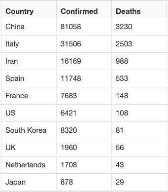
Top 10 Countries by COVID-19 Deaths - Showing Confirmed Cases and Death Totals

South Korean Death Totals Remain Flat
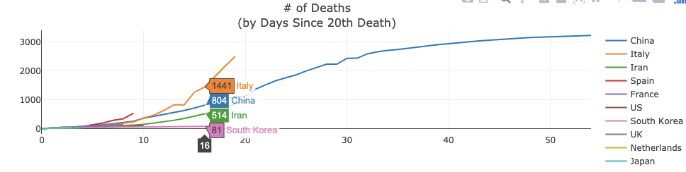
Sixteen days after seeing their 20th death, South Korea only has 81 total deaths. Compare this to Italy which saw 1441 total deaths 16 days after seeing their 20th death. This apples-to-apples comparison shows both how dire the situation is in Italy and how relatively under control it is in South Korea.
Italy looks to be on track to pass the 3,000 death mark about 20 days faster than China did, and soon they will have more total COVID-19 deaths than China. Those are staggering statements considering the total population of each country.
The US, Japan, and Netherlands Have the Best Chance of Seeing a South Korea-like Flat Death Curve
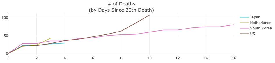
Over the last two days (day nine and ten since their 20th death), the US has seen a jump in deaths from 63 to 108. This is not good. However, if Percentage of the Population with Deaths is an indicator of conditions on the ground, then, in the big picture, this jump in the US is less worrisome. Further, under this assumption, the Netherlands numbers don’t look that encouraging.
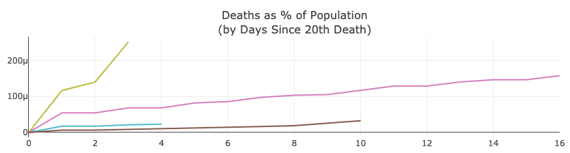
Netherlands, Spain, Italy, and Iran Experience the Worst Percentage of Population Death Curves
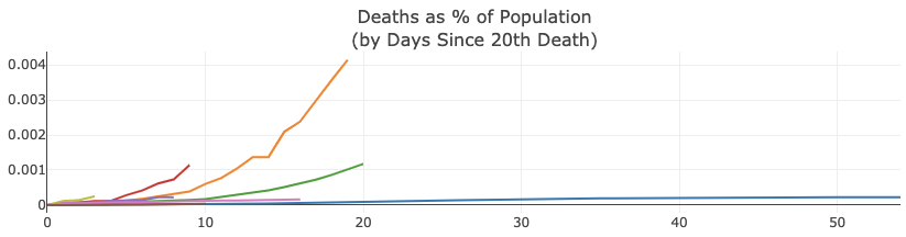
The Netherlands currently has the worst percentage of population death curve of any country on this list. On day three since seeing its 20th death, 0.00025% of its population has died from COVID-19. This is two days earlier than when Spain hit the same percentage. Four days earlier than Italy. Nine days earlier than Iran. No other country on the list has reached that percentage.
Spain and the Netherlands have similar percentages of population death curves to Italy. If trends continue, they can look to Italy’s curve for what to expect, only they will get there much quicker in their journey.
There are many more observations that I could make, but I’ll stop there. The data will change over the coming days, and we’ll all be able to come to our own conclusions as the story unfolds.
I hope you have found this unique view of coronavirus death and case data helpful. To those sick with the coronavirus or who have loved ones who are, know that billions of people around the world are sending you well-wishes, prayers, and hopeful thoughts for speedy recoveries. And to those on the front lines helping to save lives and protect communities, you have the world’s respect and deepest gratitude.

Josh Poduska is the Chief Field Data Scientist at Domino Data Lab and has 20+ years of experience in analytics. Josh has built data science solutions across domains including manufacturing, public sector, and retail. Josh has also managed teams and led data science strategy at multiple companies, and he currently manages Domino’s Field Data Science team. Josh has a Masters in Applied Statistics from Cornell University. You can connect with Josh at https://www.linkedin.com/in/joshpoduska/
Summary
- Top 10 Countries by COVID-19 Deaths - Showing Confirmed Cases and Death Totals
- South Korean Death Totals Remain Flat
- The US, Japan, and Netherlands Have the Best Chance of Seeing a South Korea-like Flat Death Curve
- Netherlands, Spain, Italy, and Iran Experience the Worst Percentage of Population Death Curves
RELATED TAGS
SHARE


Subscribe to the Domino Newsletter
Receive data science tips and tutorials from leading Data Science leaders, right to your inbox.
By submitting this form you agree to receive communications from Domino related to products and services in accordance with Domino's privacy policy and may opt-out at anytime.