By David Bloch, Data Science Evangelist, Domino on April 21, 2020 in Perspective
As the world moved at a frenzied pace to limit the impact and spread of COVID-19, there’s been a call to action within the data science industry to help accelerate the research of new prevention measures and techniques and to educate people on subjects such as exponential growth rates and the importance of staying at home to restrict to the spread.
On an unprecedented scale, health, academic and government organizations moved to make datasets publicly available for analysis, exploration and research. These same datasets are being used by news media to tell the story of the novel coronavirus and educate the public about measures such as social distancing that can slow the rate of infection and help hospitals deal with the virus.
How Data Scientists have helped fight the spread
A key principle in the progression of scientific research is an ability to “stand on the shoulders of the giants before me.” It’s important for researchers to gain access to previous hypotheses, experimentation, and the knowledge of other scientists to help build new insights.
Cloud computing adoption alongside the popularity of notebook working solutions make it easy for researchers to share their working notes, algorithms, and underlying resources such as data. Many organizations have sought to use their internal data science capabilities to help accelerate research into the virus. For instance:
- The Alibaba Group’s science and research academy has developed a COVID-19 diagnosis model that utilizes computed tomography (CT) scanners with medical imaging classifications to diagnose the COVID-19 virus. This system condenses a typical 10-15 minute diagnosis by an experienced doctor down to 20 seconds – crucial time savings when medical resources are being overwhelmed.
- Kaggle – a platform that hosts a series of competitions in which businesses offer a challenge alongside data to find a solution for financial rewards – has created a resource center and a series of starting point articles to help the data science community get easily started in their pursuit of delivering new intelligence.
- Zindi – a startup based out of South Africa that has been connecting a community of Data Scientists in Africa has announced cash prizes to its 12,000 data scientists to get involved in finding new insights and information that can be used to help fight COVID-19.
- Microsoft shared a series of academic papers paired with some tooling that makes it easier to search through literature using natural language processing techniques to help researchers quickly find relevant information. They’ve also combined previous research examples from viruses that act in a similar manner to COVID-19 such as the SARS virus.
- Reinsurance provider SCOR dedicated a task force to the analysis of the COVID-19 outbreak crisis. The team is composed of experts from their Knowledge Community including doctors, epidemiologists, actuaries and data scientists. Based on the data repository made available by Johns Hopkins University, they built and released a public web app in Domino to help visualize COVID-19 trends in a practical display of the essential information. Initially set up to build biometric risk models, the multi-expertise task force realized that sharing the data could help better inform the public.
- Bayer Data Scientist Jeffrey Pobst built an app in Domino to analyze Wikipedia trends for terms surrounding COVID-19 across languages – looking at traffic to pages titled “coronavirus”, “pandemic”, “covid-19”, and also interestingly relevant pages for “toilet paper”, “hand sanitizer”, “antivirals”, “telecommuting”, and so on. The app highlights what societies have been researching, how curiosity has spiked and waned across various geographic territories, and may present interesting correlations around the cultural impact this pandemic has seen regionally over time.
- The White House, sensing the potential for data science and artificial intelligence applications, has urged technology organizations to contribute to research.
The urgency shown by the scientific community to discover new sources of insight that helped to fight the spread of the virus led to unprecedented information sharing across country and company borders. Large cross-functional virtual teams came together to better inform people, provide better insight and clarity that ultimately helped governments work together on solutions.
How Data Visualization better communicates the story
Data scientists apply data visualization techniques to explore information and get their bearings with massive data sets before forming and testing hypotheses.
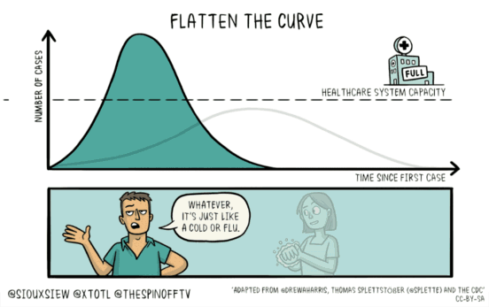
As governments sought to implement policies, such as social distancing and asking people to self-isolate, one of the growing and most important uses of data was to advise people around the reasons for the policies and why they would be effective.
Below is a series of articles and blog posts that use data visualization to create new pieces of insight and communicate clearly to their readers. They can also act as thought starters for different approaches and hypotheses a researcher might seek to work on.
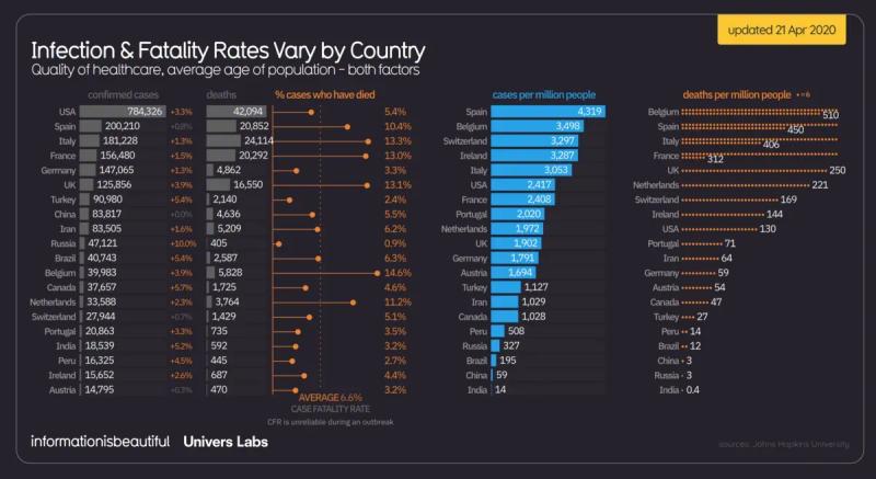
- Information is Beautiful published a series of infographics that distills large volumes of data into bite-sized chunks of information on the demographics of those impacted by the virus.
- New York Times provides a series of simulations and sliders; allowing people to easily assess the impact on the basis of how communicable the disease is, alongside the mortality rate; providing information by country and state that utilises population demographics alongside what we currently know about the virus.
- The team at Johns Hopkins has put together an amazing resource center filled with datasets and information, including a comprehensive dashboard charting key statistics relating to the virus and its spread across the population.
- The Washington Post provides a series of animated visualizations that show different scenarios of disease spread. They introduce the purpose behind social distancing and show how it helps slow the spread of the virus, giving the health sector a better chance to manage its impact. Source: Information is Beautiful

Other resources
- Fast AI provides a collection of insights and thoughts about the role of data science in tackling COVID-19 that helps define and describe the problem at hand, and demonstrates how data scientists can assist.
- Towards Data Science published a blog that assists people building out a dashboard relating the spread of the coronavirus, alongside their exploratory analysis of growth patterns for COVID with access to their underlying code base.
- Johns Hopkins University has made its datasets publicly available via GitHub, posting multiple updates of data throughout the day for Data Scientists and Analysts to access.
- Harvard University has made literature, academic case studies, datasets and code bases available on its China Data Lab website. Source: Towards Data Science

RELATED TAGS
SHARE


Subscribe to the Domino Newsletter
Receive data science tips and tutorials from leading Data Science leaders, right to your inbox.
By submitting this form you agree to receive communications from Domino related to products and services in accordance with Domino's privacy policy and may opt-out at anytime.