Dr. Connie Brett is the owner of Aggregate Genius. Dr. Connie Brett provides custom visualization tool development and support for the Translational Bioinformatics team at Bristol-Myers Squibb and is also the maintainer of the CRAN package for canvasXpress. The team develops and supports tools including canvasXpress to help break down obstacles to scientific research and development.
Introducing canvasXpress
Everyone has their favorite data visualization packages - whether ggpot, plotly, or one of the many others out there. However, once there are tens of thousands of visualization objects (e.g. points) on a chart, one of the problems that is often encountered is that those common visualization tools will bog down and performance suffers. But, as you may have heard, there's a package for that – canvasXpress.
CanvasXpress was developed as the core visualization component for bioinformatics and systems biology analysis at Bristol-Myers Squibb. Creating charts in this library is intuitive, and through simple configuration changes you can create rich, scalable and widely portable charts. The library supports a large number of visualization types and includes a simple and unobtrusive set of user interface functionality right on the visualization to allow the user to zoom, filter, transform, cluster, download and much more. The library is actively maintained and developed by Isaac Neuhaus, including a fully documented companion CRAN R package that I maintain. The R package wraps the extensive API options right into an htmlwidget - which means that canvasXpress can be used within RStudio to generate plots in the console, or embed them seamlessly in RMarkdown or Shiny web applications.
In this post, I’ll walk you through creating and customizing a large chart from raw data into something you can drop into an RMarkdown or Shiny app.
Data Notes
CanvasXpress easily handles multi-dimensional and large datasets for visualization. The canvasXpress functionality in the browser generally expects data to be in a wide format and utilizes both column- and row-names to cross-reference and access the various slices of data needed to make the charts so it's worth taking a minute to define some of the commonly used terms in canvasXpress.
Variables are the rows of data in the main data frame and the variable names are drawn from the row names.
Samples are the columns of data in the main data frame and the sample names are drawn from the column names.
Annotations are extra information or characteristics. These data points add to the information about samples or variables but are not a part of the main dataset. Annotations can be present for the rows (variables) or columns (samples) or both.
Building Charts
Now that we’ve covered commonly used terms let’s walk through building your chart from the ground up in canvasXpress using a single R function call. For illustrative purposes, the chart we are building is based on two downloadable datasets from the World Bank. Although canvasXpress was built to visualize biological data, it will work on any dataset subject. The canvasXpress function call in R uses named variables, so the order of the options doesn’t matter – in fact as you use the package you’ll develop your own favorite options and ordering. As we build the function call up the code blocks will point out changes using bold type.
To start with, we will read the data into two R objects: y and x. The y object will contain the main dataset we are building the chart on - world population for each country. The samples for this dataset are the countries (columns), and the there is only one variable (row) in this dataset - the population. The second dataset is read into the x object and will hold the sample annotation, or additional information, for each country such as the GNI (Gross National Income).
Our first visualization of this data is super-simple - we just want to see a bar chart of population by country:
y <- read.table("http://www.canvasxpress.org/data/cX-stacked1-dat.txt",
                header = TRUE, sep = "\t", quote = "", row.names = 1,
                fill = TRUE, check.names = FALSE, stringsAsFactors = FALSE)
x <- read.table("http://www.canvasxpress.org/data/cX-stacked1-smp.txt",
                header = TRUE, sep = "\t", quote = "", row.names = 1,
                fill = TRUE, check.names = FALSE, stringsAsFactors = FALSE)library(canvasXpress)canvasXpress(data = y, graphType = "Bar")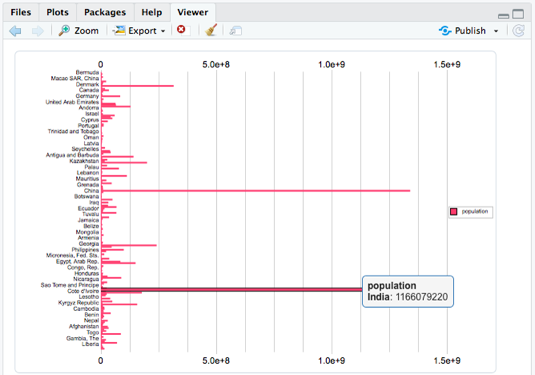
You already have built-in tooltips and all the canvasXpress toolbar functionality (filtering, downloads, etc.) in addition to your bar chart - and in a single call while only specifying the graphType. Now let's work on making this bar chart better by changing the orientation, adding a title, rotating the labels and taking the legend off the chart:
canvasXpress(data             = y,
             graphType        = "Bar",
             graphOrientation = "vertical",
             title            = "Country Population",
             smpLabelRotate   = 45,
             showLegend       = FALSE)
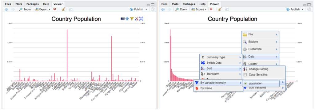
In the left screenshot, you can see the canvasXpress chart toolbar on the top right. The chart also has a context menu (right-click) that is used in the right screenshot to choose the variable to sort the data by. None of these tools required any configuration to setup and are a feature of the chart itself – whether hosted in RStudio’s view pane, a shiny application, RMarkdown document, or right on an html web page. Take a few minutes to explore these rich tools for downloading, filter, formatting, changing chart types, properties, and even the data itself!
Moving to the next level of charting is easy – add transitions right into the chart itself. The code below adds a sorting transition right into the chart - you’ll have to try it out since screen shots are static! These transitions not only perform something functional (e.g. sort the data) but they also can be used as additional context for your users as to how the data and chart were manipulated. Plus, they also add some eye-candy with almost no work on your part!
canvasXpress(data             = y,

             graphType        = "Bar",

             graphOrientation = "vertical",

             title            = "Country Population",

             smpLabelRotate   = 45,

             showLegend       = FALSE,

             sortDir          = "descending",

             showTransition   = TRUE,

             afterRender      = list(list("sortSamplesByVariable",
                                     list("population"))))
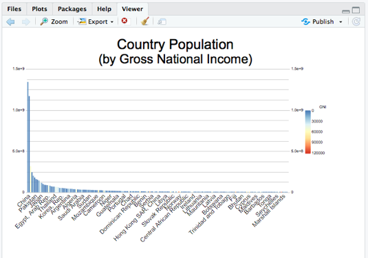
Ok - now that we’ve got an idea of the data we have let’s make the chart more useful by coloring the chart by Gross National Income. This is an “annotation” or extra information on the samples in the dataset (e.g. countries). We have loaded a dataset of information all about the countries in the x object, let’s add it to the chart in smpAnnot, and color by the GNI. We’ll turn back on the legend as well by commenting out the showLegend = FALSE line and add a subtitle to the chart enumerating the dataset addition.
canvasXpress(data             = y,

             smpAnnot         = x,

             graphType        = "Bar",

             graphOrientation = "vertical",

             title            = "Country Population",
             smpLabelRotate   = 45,
             #showLegend      = FALSE,

             subtitle         = "(by Gross National Income)",

             colorBy          = list("GNI"),

             sortDir          = "descending",

             showTransition   = TRUE,

             afterRender      = list(list("sortSamplesByVariable",
                                     list("population"))))
Finally, I want to group the data by continent into a stacked bar chart to make it easier to read. It’d be great to show it as a tree map instead of a simple stacked bar -- it’s only two additional options:
canvasXpress(data             = y,

             smpAnnot         = x,

             graphType        = "Stacked",

             graphOrientation = "vertical",

             title            = "Country Population",
             smpLabelRotate   = 45,
             #showLegend      = FALSE,

             subtitle         = "(by Gross National Income)",

             colorBy          = list("GNI"),

             treemapBy        = list("ISO3"),

             groupingFactors  = list("continent"),

             sortDir          = "descending",

             showTransition   = TRUE,

             afterRender      = list(list("sortSamplesByVariable",
                                     list("population"))))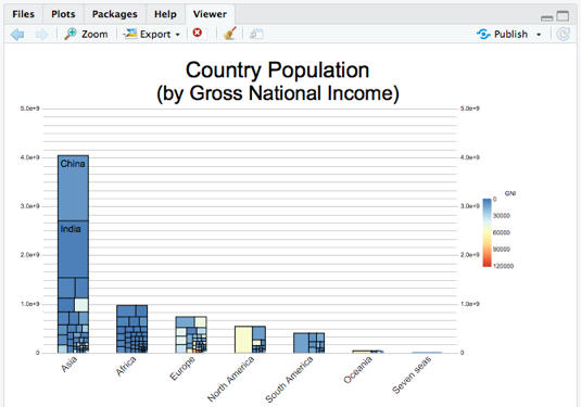
Now I have a very rich dataset in my chart complete with tooltips, visual transitions, and rich interactivity. Wherever I deploy this chart my users will get all the functionality built into every canvasXpress chart to filter, sort, zoom, pan, download, and a lot more – without writing any additional code and in a single function call. I can drop this chart’s code right into a shiny application or RMarkdown anywhere I can use an htmlwidget, and the performance of the chart will scale well to tens of thousands of data points.
Here is a one-page shiny app that shows this chart – a canvasXpressOutput in the ui call is paired with a renderCanvasXpress reactive in the server call that contains the exact same canvasXpress function call we created above:
library(shiny)library(canvasXpress)ui <- fluidPage(
    flowLayout(canvasXpressOutput("exampleChart", width = "800px"))
)server <- function(input, output) {
    y <- read.table("http://www.canvasxpress.org/data/cX-stacked1-dat.txt",
                    header = TRUE, sep = "\t", quote = "", row.names = 1,
                    fill = TRUE, check.names = FALSE, stringsAsFactors = FALSE)
    x <- read.table("http://www.canvasxpress.org/data/cX-stacked1-smp.txt",
                    header = TRUE, sep = "\t", quote = "", row.names = 1,
                    fill = TRUE, check.names = FALSE, stringsAsFactors = FALSE)    output$exampleChart <- renderCanvasXpress({
        canvasXpress(data             = y,
                     smpAnnot         = x,
                     graphType        = "Stacked",
                     graphOrientation = "vertical",
                     title            = "Country Population",
                     smpLabelRotate   = 45,
                     #showLegend      = FALSE,
                     subtitle         = "(by Gross National Income)",
                     colorBy          = list("GNI"),
                     treemapBy        = list("ISO3"),
                     groupingFactors  = list("continent"),
                     sortDir          = "descending",
                     showTransition   = TRUE,
                     afterRender      = list(list("sortSamplesByVariable",
                                                  list("population"))))
    })
}shinyApp(ui = ui, server = server)
Wrap-Up
The canvasXpress website has R code for hundreds of charts of dozens of types in the Examples section of the website. You can copy/paste the R code right into the console in RStudio and create the chart, explore how the data was setup, the various options for customization, etc. This is a great way to become familiar with the exact chart type you are interested in! In addition, there are three pre-built example applications in Shiny using canvasXpress visualizations that you can launch using the cxShinyExample() function. By making simple configuration changes using the extensive API options (also detailed on the website) your charts can be rich, scalable, and widely portable.

Domino Data Lab empowers the largest AI-driven enterprises to build and operate AI at scale. Domino’s Enterprise AI Platform unifies the flexibility AI teams want with the visibility and control the enterprise requires. Domino enables a repeatable and agile ML lifecycle for faster, responsible AI impact with lower costs. With Domino, global enterprises can develop better medicines, grow more productive crops, develop more competitive products, and more. Founded in 2013, Domino is backed by Sequoia Capital, Coatue Management, NVIDIA, Snowflake, and other leading investors.
SHARE
Subscribe to the Domino Newsletter
Receive data science tips and tutorials from leading Data Science leaders, right to your inbox.
By submitting this form you agree to receive communications from Domino related to products and services in accordance with Domino's privacy policy and may opt-out at anytime.