Return to blog home
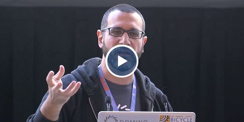
This talk was presented live at PLOTCON 2016 in NYC on November 18, 2016.
Scatterplot or bubble chart – what visualization makes the most sense for your data? In this presentation, Eduardo Ariño de la Rubia, Chief Data Scientist at Domino Data Lab takes us on a journey through 23 different visualizations and discusses the tradeoffs and scenarios in which they are the most relevant.
Tune in to:
- Learn how much code it takes to generate these visualizations using a number of popular data visualization libraries;
- Get a tour of different ways to visualize 7 types of data, from change and distribution to relationship and composition;
- See which visualizations should rarely be used, and pitfalls of some attractive but less interpretable designs.
RELATED TAGS
Subscribe to the Domino Newsletter
Receive data science tips and tutorials from leading Data Science leaders, right to your inbox.
By submitting this form you agree to receive communications from Domino related to products and services in accordance with Domino's privacy policy and may opt-out at anytime.


