
Welcome to Part II of "Advanced Jupyter Notebook Tricks." In Part I, I described magics, and how to calculate notebooks in "batch" mode to use them as reports or dashboards. In this post, I describe another powerful feature of Jupyter notebooks: The ability to use interactive widgets to build interactive dashboards.
Business Intelligence on Steroids
Why might we want to add interactivity to a notebook? One reason is to use more powerful tools to address traditional business intelligence use cases. Traditional BI tools work great if you are building a dashboard on top of SQL, but if you want to visualize information that is generated by some more sophisticated logic, they typically fall short.
With interactive widgets in a Notebook, you can use the full power of Python to express calculations and generate visualization — while exposing "knobs and dials" to an end user so they can control aspects of the visualization. In this sense, you can use Notebooks as lightweight "apps" for anyone.
Intro to ipywidgets
Functionality for adding widgets resides in the ipywidgets package, so we'll want to start out by importing that:
from ipywidgets import widgetsOnce you've imported that, there are various types of UI elements you can add. You can think of a widget as having two parts:
- The UI/HTML element that renders in the output cell (e.g., a textbox)
- An event handler that lets you specify what should happen when the value changes. In most cases, you'll want to define a Python function that gets called when the user changes the input, so you can update other elements of your notebook (e.g., visualizations) accordingly.
Basic types of widgets
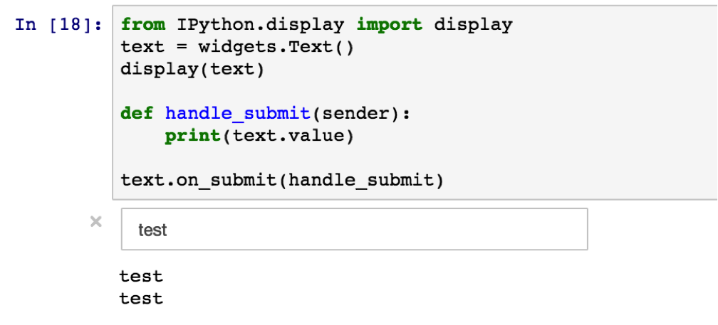
- Text input: You can create a text input field by using the
widgets.Text(). The.on_submit()listens to the activity and calls a function to handle the activity.
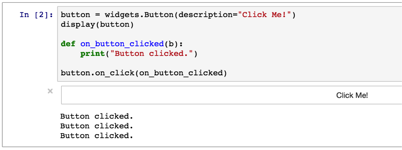
- Buttons: The button widget works similar to the text input one.
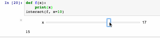
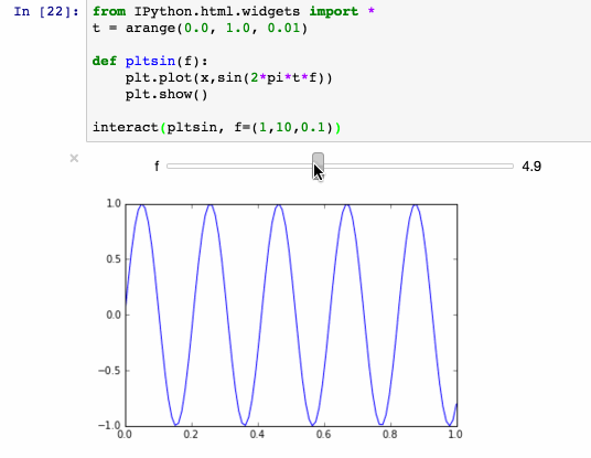
- Interact: Apart from the default widgets there is also "interact" which automatically generates a widget based on the arguments that you use.
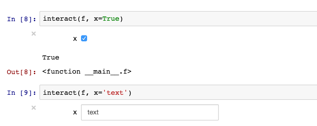
The first argument is the function that handles the selected value of the second argument. The type of second argument will decide the form of the interaction. As you can see: an integer results in a slider. Giving a boolean (interact(f, x=True)) creates a checkbox.
You can store widgets in variables in your notebook just like any other type of value. This lets you bind the input of one widget to the value of another -- possibly with some sort of calculation/manipulation in the middle. As a simple example:
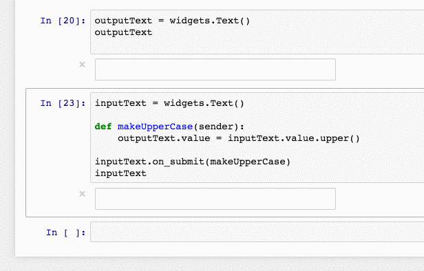
We create two widgets, an input and output. When the value of the input widget changes, we take the new value and update the value of the input widget. You can create much more sophisticated interactions this way.
Interactive visualizations
The power of widgets comes from the fact that you can connect your own Python functions to run when a user changes the input's value. Among other things, that lets you make visualizations that respond dynamically to changes in the user's input. E.g.,
This core flexibility unlocks tremendous potential for using notebooks as dashboards. For example, you can expose widgets to filter, group, or sort data; your Python code can then query data sources, calculate derived data, use pandas and other great packages to do in-memory manipulation — and then render results using any number of great Python visualization packages.
Putting it together
To wrap up, I wanted to combine the concepts in my last post (magics, data pipelines) with the interactive widgets described above. The result is a mini "app" in a notebook: a user can provide a domain name, and the notebook will ping the domain and plot response times on a graph.
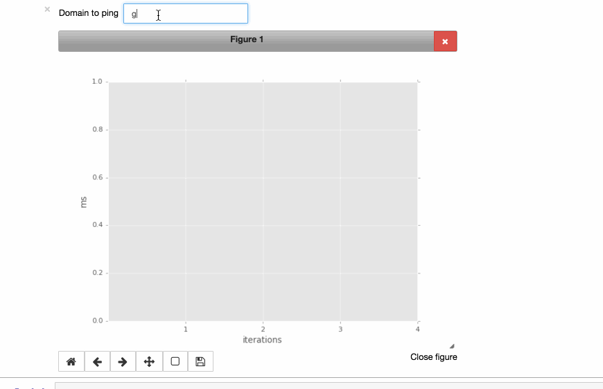
See below for the code to create this.
%matplotlib notebook
import pandas as pd
import matplotlib.pyplot as plt
from ipywidgets import *
from IPython.display import display
from IPython.html import widgets
plt.style.use("ggplot")

NUMBER_OF_PINGS = 4

# displaying the text widget
text = widgets.Text(description="Domain to ping", width=200)
display(text)

# preparing the plot
data = pd.DataFrame()
x = range(1,NUMBER_OF_PINGS+1)
plots = dict()
fig, ax = plt.subplots()
plt.xlabel("iterations")
plt.ylabel("ms")
plt.xticks(x)
plt.show()

# preparing a container to put in created checkbox per domain
checkboxes = []
cb_container = widgets.HBox()
display(cb_container)

# add button that updates the graph based on the checkboxes
button = widgets.Button(description="Update the graph")

# function to deal with the added domain name
def handle_submit(sender):
    # a part of the magic inside python : pinging
    res = !ping -c {NUMBER_OF_PINGS} {text.value}
    hits = res.grep("64 bytes").fields(-2).s.replace("time=","").split()
    if len(hits) == 0:
       print("Domain gave error on pinging")
    else:
         # rebuild plot based on ping result
        data = hits
        data = data.astype(float)
        plots, = ax.plot(x, data, label=text.value)
        plt.legend()
        plt.draw()
        # add a new checkbox for the new domain
        checkboxes.append(widgets.Checkbox(description = text.value, value=True, width=90))
        cb_container.children=[i for i in checkboxes]
        if len(checkboxes) == 1:
            display(button)

# function to deal with the checkbox update button
def on_button_clicked(b):
    for c in cb_container.children:
        if not c.value:
            plots.set_visible(False)
        else:
            plots.set_visible(True)
    plt.legend()
    plt.draw()

button.on_click(on_button_clicked)
text.on_submit(handle_submit)
plt.show()
And so I conclude this blog, but not because this is all there is to tell and show. I can keep going, but I'd rather see you give them a try. Please share in the comments what fancy notebook option you discovered while working on your own project.
SHARE
Other posts you might be interested in


Subscribe to the Domino Newsletter
Receive data science tips and tutorials from leading Data Science leaders, right to your inbox.
By submitting this form you agree to receive communications from Domino related to products and services in accordance with Domino's privacy policy and may opt-out at anytime.